The Pub Discussion Board
Get your favorite beverage, sit back, and join in the discussion
You are not logged in.
#1 2011-02-20 23:26:00
- Eric Storm
- Pub Owner

- From: New Port Richey, FL
- Registered: 2006-09-12
- Posts: 5754
- Website
Request for Comment - Search Results display
Okay, folks. I'm working on an upgrade to the website, and I have a question regarding the way search results are displayed on the site.
Currently, if you do a search, or if you look at the Recent Submissions page, or other such functions, you will see a list of results that look like this: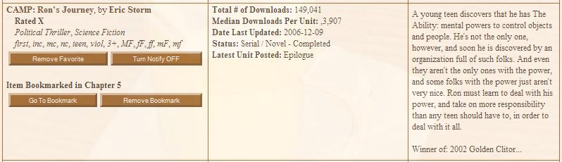
Now, it is my personal feeling that, when presented in a whole list of similar items, this is way too cluttered. Also, displaying every piece of information available about the story slows down the script, which increases page load times.
I'm considering a reduction in the amount of information initially displayed, with an option (via a link, button, or icon) for getting the remainder of the information for any specific story.
My request is two-fold:
1. Tell me if you think this is a good idea, and why or why not...
and
2. If you think it is a good idea, what information do you think is vital to be displayed on the results page without the user clicking anything? (In other words, what would show up initially)
Please let me know what you think.
Thank you for your time,
Eric Storm
Please Remember: The right to Freedom of Speech does not carry the proviso, "As long as it doesn't upset anyone." The US Constitution does not grant you the right to not be offended. If you don't like what someone's saying... IGNORE THEM.
----
Facebook page
Offline
#2 2011-02-21 04:31:02
- Jefferson
- Completely Blotto

- From: East Coast, USA
- Registered: 2006-12-03
- Posts: 449
Re: Request for Comment - Search Results display
I will only respond to part of this, layout and design is not my thing. I leave that kind of thing to Annie. I will comment what I think should be displayed, what I would want displayed as both a reader and, every now and then, a writer.
First thing to remember, is these are search results. If you want more information, you can click on it and get ALL the information. So... with that in mind...
Story title, author, genre, complete or in progress, a quick description and the codes.
For search results, this should be enough. If it looks interesting, you can always click on it and get all the information.
Offline
#3 2011-02-21 05:21:22
- Eric Storm
- Pub Owner
- From: New Port Richey, FL
- Registered: 2006-09-12
- Posts: 5754
- Website
Re: Request for Comment - Search Results display
Can I ask why you need the codes on the initial page?
Eric
Please Remember: The right to Freedom of Speech does not carry the proviso, "As long as it doesn't upset anyone." The US Constitution does not grant you the right to not be offended. If you don't like what someone's saying... IGNORE THEM.
----
Facebook page
Offline
#4 2011-02-21 05:40:52
- Storymaster69
- Completely Blotto

- From: Alberta, Canada
- Registered: 2006-11-07
- Posts: 329
Re: Request for Comment - Search Results display
Eric Storm wrote:
Can I ask why you need the codes on the initial page?
Eric
I can't speak for Jefferson but for me it would be so that I could easily pick out the type of story I'm looking for.
I'm not sure if this would make a difference in the loading times because I don't fully know what the hangup is for the display but can you do some sort of Java Script thingy where you hover you mouse over the item and the long explanation appears? Alternatively you could do something like what Amazon does where it only displays a limited portion of the text not worrying if it cuts off, if I want to read the whole thing I then click a link at the end to get the full text.
Sex isn't the answer.
Sex is the question.
Yes is the answer.
Offline
#5 2011-02-21 06:10:11
- Cenobite829
- Inebriated

- Registered: 2010-11-13
- Posts: 28
Re: Request for Comment - Search Results display
Personally I would want to see just the title, the author, Short Story or Novel, and the codes in the search. This is because I search by the codes myself.
Jigsaw: If you're good at anticipating the human mind. It leaves nothing to chance
Offline
#6 2011-02-21 08:10:09
- Jefferson
- Completely Blotto
- From: East Coast, USA
- Registered: 2006-12-03
- Posts: 449
Re: Request for Comment - Search Results display
What they said. 
Offline
#7 2011-02-21 09:32:14
- Eric Storm
- Pub Owner
- From: New Port Richey, FL
- Registered: 2006-09-12
- Posts: 5754
- Website
Re: Request for Comment - Search Results display
Okay, I'll take the issues here one at a time:
1. SM: What you're talking about would require all of the information to be loaded on page load. This would not reduce page load time in the slightest. This is because people would expect the information to appear instantly on hover. With a click, people expect a delay, which is what they're going to get, since information retrieval would be taking place. Amazon may have a faster server, which would allow them to do information retrieval on hover. GoDaddy is NOT fast enough for that.
2. Cenobite: If you did a *search* on the codes, why do you need to see them in the initial display? You know that every story you see will have the codes you requested...
Eric Storm
Please Remember: The right to Freedom of Speech does not carry the proviso, "As long as it doesn't upset anyone." The US Constitution does not grant you the right to not be offended. If you don't like what someone's saying... IGNORE THEM.
----
Facebook page
Offline
#8 2011-02-21 18:51:25
- Bd.Carlo
- Inebriated
- From: B.C. canada
- Registered: 2009-11-06
- Posts: 62
Re: Request for Comment - Search Results display
I would like the same things on the search results page, as Jefferson. I think a short description, that is maybe a portion of the full description. Something like the first 200 characters of the description and then it cuts it off, if you want to read the rest of it, click on the link. Just my two cents.
"Genius may have its limitations, but stupidity is not thus handicapped." Elbert Hubbard
"A bookstore is one of the only pieces of evidence we have that people are still thinking." Jerry Seinfeld
Offline
#9 2011-02-21 21:51:11
- Cenobite829
- Inebriated
- Registered: 2010-11-13
- Posts: 28
Re: Request for Comment - Search Results display
Seeing the codes is more just to see what else is in the story. It isn't essential but it is nice and it won't add that much more to the page.
Jigsaw: If you're good at anticipating the human mind. It leaves nothing to chance
Offline
#10 2011-02-21 23:59:02
- Eric Storm
- Pub Owner
- From: New Port Richey, FL
- Registered: 2006-09-12
- Posts: 5754
- Website
Re: Request for Comment - Search Results display
No, but it will add quite a bit to the load time, unless I do a little reworking on the database. I've already figured out how to do that, since it's quite obvious that everyone insists on seeing the story codes first-thing out.
Eric Storm
Please Remember: The right to Freedom of Speech does not carry the proviso, "As long as it doesn't upset anyone." The US Constitution does not grant you the right to not be offended. If you don't like what someone's saying... IGNORE THEM.
----
Facebook page
Offline
#11 2011-02-27 00:34:55
- Imagineer
- Wasted
- From: Oak Valley
- Registered: 2006-11-27
- Posts: 214
Re: Request for Comment - Search Results display
I don't do a lot of searching here -- once you've been here a bit and found writers you like, it becomes less important -- but I like the current results. Sure, it's a lot of info on each item, but it seems like a good format, well-suited to browsing. Generally, out there on the Internet, I find that the speed of initial results is less important than being able to review those results without a lot of clicking into each item.
If folks think the results are really too cluttered, one could move either the stats or the description into a hover-bubble. I know that doesn't do anything to improve initial load time, but it could put more results on a single page, if folks think that's an issue.
I do have to agree with the others that, when browsing through this particular kind of content, a story's codeset is very useful, perhaps moreso than any other field when reviewing results. It tells me what kind of content a story has that might light my fire OR put it out. As a writer I might wish for my creations to be given a chance without snap judgements based on codes, but too many readers won't find stories without them.
Offline
#12 2011-02-27 03:26:35
- Eric Storm
- Pub Owner
- From: New Port Richey, FL
- Registered: 2006-09-12
- Posts: 5754
- Website
Re: Request for Comment - Search Results display
What I find distressing, on a purely personal level, is that everyone who has commented here has been willing to forego the description - the "real" information about what the story is about - in favor of codes about the sex.
Since people want the codes, I've found a way to get the codes more efficiently, but I do find it, as I said, a bit distressing that the sex is still more important than the plot.
Eric Storm
Please Remember: The right to Freedom of Speech does not carry the proviso, "As long as it doesn't upset anyone." The US Constitution does not grant you the right to not be offended. If you don't like what someone's saying... IGNORE THEM.
----
Facebook page
Offline
#13 2011-02-28 08:17:58
- Bd.Carlo
- Inebriated
- From: B.C. canada
- Registered: 2009-11-06
- Posts: 62
Re: Request for Comment - Search Results display
I want the codes to tell me if the story is going to skwick me, and the description to tell me if I want to read it or not. does that make sense? Personally I think the description is just as important as the codes.
"Genius may have its limitations, but stupidity is not thus handicapped." Elbert Hubbard
"A bookstore is one of the only pieces of evidence we have that people are still thinking." Jerry Seinfeld
Offline
#14 2011-03-16 21:48:53
- Eric Storm
- Pub Owner
- From: New Port Richey, FL
- Registered: 2006-09-12
- Posts: 5754
- Website
Re: Request for Comment - Search Results display
Okay, to continue this discussion, here is a screenshot of the proposed new results list: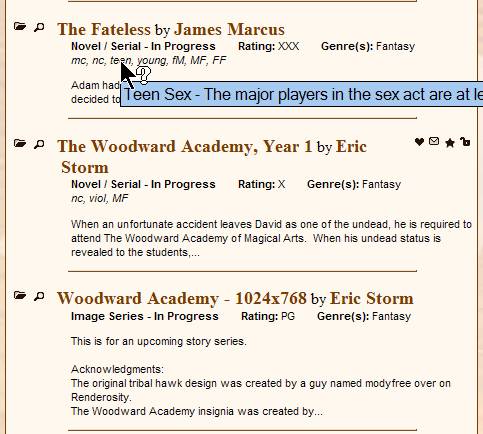
As you can see, all the codes have been included. (except on things that have no codes - check the Image Series, rated PG, it has no codes in it.) I have even shown how the tooltips for the codes will work. These tooltips are assigned to content codes, pairing codes, genres, statuses, and ratings.
The icons on the right-hand side are informational only, and are explained in a legend. The two on the left-hand side are the ones that do work.
The folder icon is (as you would expect), the "open story" icon. You can also achieve this by clicking on the name of the story.
The magnifying glass icon is the "more information" icon. If you click this, a box pops up (strictly within the site, it is not a "system" dialog), which gives you all of the information about the story you could ever want. If requested, I'll take a screenshot of that, too.
So, seeing this in front of you, please give constructive comments.
Eric Storm
Please Remember: The right to Freedom of Speech does not carry the proviso, "As long as it doesn't upset anyone." The US Constitution does not grant you the right to not be offended. If you don't like what someone's saying... IGNORE THEM.
----
Facebook page
Offline
#15 2011-03-17 01:03:32
- Jefferson
- Completely Blotto
- From: East Coast, USA
- Registered: 2006-12-03
- Posts: 449
Re: Request for Comment - Search Results display
I'd give some constructive criticism but I honestly don't have any.
I love it. It looks perfect. Well done.
Offline
#16 2011-03-17 01:08:17
- Cenobite829
- Inebriated
- Registered: 2010-11-13
- Posts: 28
Re: Request for Comment - Search Results display
It looks great Eric.
Jigsaw: If you're good at anticipating the human mind. It leaves nothing to chance
Offline
#17 2011-03-17 05:36:51
- Bd.Carlo
- Inebriated
- From: B.C. canada
- Registered: 2009-11-06
- Posts: 62
Re: Request for Comment - Search Results display
It looks really, really, good. i especially like the tool tips.
"Genius may have its limitations, but stupidity is not thus handicapped." Elbert Hubbard
"A bookstore is one of the only pieces of evidence we have that people are still thinking." Jerry Seinfeld
Offline
#18 2011-03-18 02:41:43
- Storymaster69
- Completely Blotto
- From: Alberta, Canada
- Registered: 2006-11-07
- Posts: 329
Re: Request for Comment - Search Results display
If it doesn't do it already, the only thing I would add is when you hover your pointer over the icons it does the popup balloon to explain what it does.
Sex isn't the answer.
Sex is the question.
Yes is the answer.
Offline
#19 2011-03-18 03:13:39
- Eric Storm
- Pub Owner
- From: New Port Richey, FL
- Registered: 2006-09-12
- Posts: 5754
- Website
Re: Request for Comment - Search Results display
Yes, each one has a brief description. The legend (which pops up in a dialog box of its own when you ask for it) has a longer description, but there is a tooltip even for the informational-only icons.
Eric Storm
Please Remember: The right to Freedom of Speech does not carry the proviso, "As long as it doesn't upset anyone." The US Constitution does not grant you the right to not be offended. If you don't like what someone's saying... IGNORE THEM.
----
Facebook page
Offline